I’m going to be honest, this just looks utterly useless for any country that isn’t south africa, and ESPECIALLY useless for any country in the northern hemisphere.
Like, yes, sure, you’ve made all the country’s areas roughly equal, but also every single country that isn’t south africa is a distorted, warped mess that looks nothing like its actual shape.
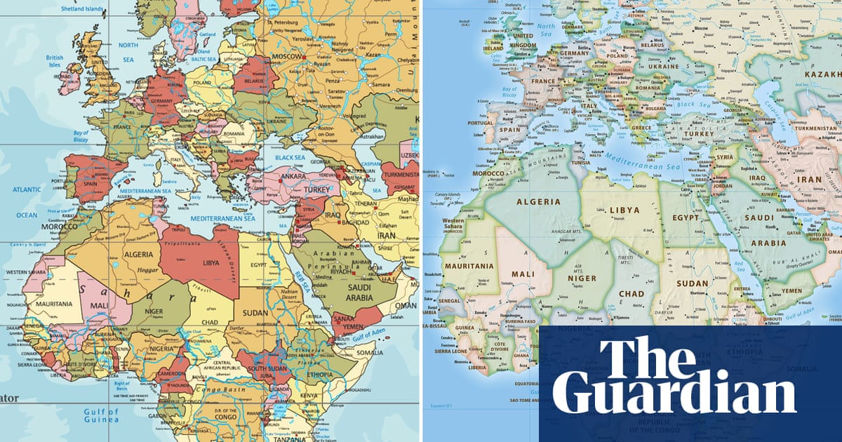
Look at parts of europe- every country is a COMPLETELY USELESS shape. Three quarters of them have been turned into diagonal lines. How the fuck is that useful? Europe is the worst area in that regard, but by no means the only one.
Every country looks distorted and warped based on your lifetime of experience looking at mercator projection. Every country looks warped and distorted when compared to globes. We learn geography on a flat surface which is inherently distorted because we live on a round surface
Actually, fun fact, the entire point of the Mercator projection is that it DOES maintain shapes/angles, just not scale. It’s a nautical map, it’s for sailing. That’s why when you look at a mercator map and a globe, the countries look about the same, just potentially different sizes- because that’s literally the point of it.
Not exactly it distorts shapes a lot. However if you pick point A on a coast and point B on a different coast the angle of the line is the heading you should sail to go from point A to point B.
So yeah very useful as a nautical map if you want to navigate from place to place. Not accurate in shape though.

I’m going to be honest, this just looks utterly useless for any country that isn’t south africa, and ESPECIALLY useless for any country in the northern hemisphere.
Like, yes, sure, you’ve made all the country’s areas roughly equal, but also every single country that isn’t south africa is a distorted, warped mess that looks nothing like its actual shape.
Look at parts of europe- every country is a COMPLETELY USELESS shape. Three quarters of them have been turned into diagonal lines. How the fuck is that useful? Europe is the worst area in that regard, but by no means the only one.
It makes it literally useless as a map.
Every country looks distorted and warped based on your lifetime of experience looking at mercator projection. Every country looks warped and distorted when compared to globes. We learn geography on a flat surface which is inherently distorted because we live on a round surface
Actually, fun fact, the entire point of the Mercator projection is that it DOES maintain shapes/angles, just not scale. It’s a nautical map, it’s for sailing. That’s why when you look at a mercator map and a globe, the countries look about the same, just potentially different sizes- because that’s literally the point of it.
Not exactly it distorts shapes a lot. However if you pick point A on a coast and point B on a different coast the angle of the line is the heading you should sail to go from point A to point B.
So yeah very useful as a nautical map if you want to navigate from place to place. Not accurate in shape though.