
“It’s [the Mercator projection] the world’s longest misinformation and disinformation campaign, and it just simply has to stop.”
No matter how we cut it though, all 2D projections will have some kind of distortion. They opted to preserve area, while the Mercator preserves angles. Arguably it is less important today to preserve angles, as we have automatic navigation systems. There are some alternatives that also preserve the area: https://upload.wikimedia.org/wikipedia/commons/7/76/The-Equal-Earth-compared-to-similar-equal-area-pseudocylindrical-projections.png
Right. What people need to understand that any globe put on a flat surface will be distorted. Their proposal is just as distorted as the Mercator, just in area vs angles as you stated.
It’s not a damn campaign. Activists never seem to be good at nuance.
The Mercator is a propaganda campaign to make Christian countries look big and powerful. Ask yourself why is it only “Christian” countries that are distorted.
Edit: should have put this /s
Maps were used for navigation, which meant angles needed to be preserved. Christian nations colonised a lot, meaning they needed to have maps for navigation a lot too.
This isn’t some weird propaganda campaign, that makes no sense. Try making an angle-preserving map that doesn’t wildly distort the north and south of the world.
Besides, not sure how Christian the icy wastes of Greenland and Antarctica are.
The Mercator projection is good in what it was made for: Navigation. You know. The whole purpose of maps.
Navigation isn’t the only purpose of maps. You can display geographical, social, economic, and a whole host of other datasets on to maps. And since maps with fidelity to lat/long lines are no longer a requirement for navigation, there’s a good argument for accurately displaying relative positioning and size.
I know right! It’s all done to further Antarctica’s hegemony! Just look how huge it seems!
/uj If you want no distortions, get a globe.
The simple fact is no map projection will be perfect or do anyone “justice”.
You’re flattening out a sphere to a flat rectangle. A lot of compromises have to be made. So go with the one that functions best for navigation.
Well a rectangle gives you easy direction, true north is always up. But you can map very accurate maps that are not rectangle. They just make navigation a bitch
Globes.
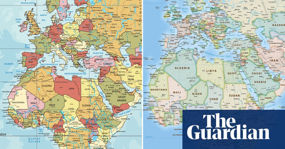
I’m going to be honest, this just looks utterly useless for any country that isn’t south africa, and ESPECIALLY useless for any country in the northern hemisphere.
Like, yes, sure, you’ve made all the country’s areas roughly equal, but also every single country that isn’t south africa is a distorted, warped mess that looks nothing like its actual shape.
Look at parts of europe- every country is a COMPLETELY USELESS shape. Three quarters of them have been turned into diagonal lines. How the fuck is that useful? Europe is the worst area in that regard, but by no means the only one.
It makes it literally useless as a map.
Every country looks distorted and warped based on your lifetime of experience looking at mercator projection. Every country looks warped and distorted when compared to globes. We learn geography on a flat surface which is inherently distorted because we live on a round surface
Actually, fun fact, the entire point of the Mercator projection is that it DOES maintain shapes/angles, just not scale. It’s a nautical map, it’s for sailing. That’s why when you look at a mercator map and a globe, the countries look about the same, just potentially different sizes- because that’s literally the point of it.
Not exactly it distorts shapes a lot. However if you pick point A on a coast and point B on a different coast the angle of the line is the heading you should sail to go from point A to point B.
So yeah very useful as a nautical map if you want to navigate from place to place. Not accurate in shape though.
It was very much a real discussion back then as well. The writers didn’t invent this argument.
People have been complaining about maps in general since we first started making them. The Gall-Peters projection that they mentioned traces its origins back to 1855 when James Gall first introduced the concept.
In the 1970’s, Arno Peters made this projection well known. He specifically argued the point the show makes: other maps distort our perception of the world and it fosters problems with how we treat some countries.
I was honestly not aware. Learn something new every day!
You’re welcome, enjoy your odd new fact :D
Stuff like this is why I really enjoy The West Wing. It often has interesting real world arguments that it plays out smartly. A bit too optimistic in our current political climate, but still fun to watch.
Beat me to it. Except it’s more like 25 years. Now get off my lawn.
Such a beautiful scene.
“But you can’t do that!”
“Why not?”
“Because you’re freaking me out!”
Like completely, or just as a default?
It’s uniquely the best option if you like using compass bearings.
Or just want a map that you can cut a small piece (up to a square 10° of longitude) from and have it just work (no skewing or non-proportional scaling required) although non-interactive world maps should use Robinson, Winkel-Tripel or something.
Of course, “a square 10° of latitude”, while the same size on the full map, will cover different areas. The side length is approximately:
- 1110 km near the equator (0°)
- 960 km in North/South Africa or Florida (30°)
- 790 km in NYC, Venice or south NZ (45°)
- 558 km in Oslo, Anchorage or northernmost Antarctic islands (60°)
- 289 km in central Greenland, northernmost peninsula of Russia or Canada or southernmost sea (75°)
- at higher latitudes, approx. 𝑥 km when 6𝑥 km from the pole
If you’re at the Amundsen-Scott research station, a square 10° of latitude won’t do, as it covers just about your bed.
Ok come up with something that’s better and just as practical.
This is truly the concern of our time.
Gerrymappering.
Looking at the correct map makes it clear that our Risk Continent Troop values need updated now.
I love how big Ukraine is on the Risk map.
LOL I hadn’t seen that one.
Reminds me of the West Wing episode with the Petersen (?) projection map. Although I seem to remember that map format was under copyright and would have required a fee for every use. An intended consequence?
16th century? Huh I would have expected a far more accurate version would have been made and accepted long ago.
Especially since during all the centuries since then accurate navigation was needed, even around Afrika, and not make journeys last far longer by keeping an incorrect map.
I would have expected a far more accurate version would have been made and accepted long ago.
The earth is a three-dimensional globe, all two-dimensional projections will be incorrect, you can only choose which aspects (e.g. distances, areas or whatever) you want to keep correct.
That’s why I use the dymaxian projection
Gall-Peters 4EVA!
This is like that one American Dallas county commissioner, William Price, getting offended it’s called Black Hole.
The notion that projections perpetuate some racial agenda is exactly the pseudo-intellectual victimhood that takes away oxygen in the room for actual issues to be addressed.


